
Distinctive Brand Assets: The Cheapest Way to Make Your Ads Work Harder
Part of our series on growing your brand without a giant budget.
You know it is a Cadbury ad before anyone says a word.
You know it is Compare the Market before the meerkat has finished his sentence.
That instant recognition is not luck, and it is not a huge production budget at work. It is a small set of distinctive brand assets, a colour, a shape, a sound, a way of talking, doing the job of making sure you get noticed and remembered without your name even needing to appear yet.
The genuinely good news for a smaller business is that building these assets is one of the cheapest things you can do in marketing, because more often than not, you already have one sitting unused.
What actually makes an asset distinctive?
A distinctive brand asset is any sensory element, a colour, a logo or shape, a sound, a character, a typeface, a tone of voice, that people learn to associate with your brand specifically. Researchers at the Ehrenberg-Bass Institute, the marketing science body behind much of the modern thinking on this, measure the strength of an asset on two dimensions. Fame, how many people recognise the asset and link it to a brand at all, and Uniqueness, whether that link belongs to you alone or gets shared with a rival. An asset that is famous but not unique is doing half a job, people notice it but credit the wrong brand, or several brands at once.
Left to their own judgement, most marketers are not very good at telling which of their own assets are actually working. A 2025 study from the Institute, published in the Journal of Brand Management, compared marketers’ own predictions against real consumer data across 405 brand elements and over 7,500 respondents, and found that marketers routinely overestimate how famous their assets are and underestimate how unique they are. In other words, the elements you are proudest of internally are not necessarily the ones doing the recognition work out in the world, which is exactly why it is worth actually looking, rather than assuming.
Logos: the strongest performer of the lot
The same 2026 benchmarking study mentioned above found that shape-based assets, which is where logos sit, outperformed every other category tested, averaging 40% fame and 71% uniqueness across the 1,162 assets studied.
A logo tends to carry more brand information than almost anything else you own, shape, colour and often a wordmark, all working at once, which is exactly why it usually tests as the strongest single asset a brand has. The catch is that the strength only holds with total consistency. A logo that gets subtly redrawn, recoloured or dropped altogether depending on the channel loses the very repetition that built its fame in the first place.
Symbols: when the mark alone does the job

A step further than a logo is a symbol, a mark that works with no wordmark and no brand name attached at all.
Nike’s swoosh, McDonald’s arches and Apple’s bitten apple are the standard examples cited across marketing science literature, chosen precisely because each one identifies its brand from shape alone, with zero text required.
That is the sharpest possible test of a distinctive asset: strip the name away entirely, and does the brand still land? Very few businesses of any size ever get their symbol to that point, but it is worth knowing it is the ceiling the rest of your assets are quietly working towards.
Mascots and characters: the asset that punches above its weight
Of every asset type studied, characters and mascots tend to perform best. Research from Jenni Romaniuk at the Ehrenberg-Bass Institute has found that characters typically outperform colour, typography and generic graphic devices on both fame and uniqueness, partly because they are so flexible.
A character can be animated, dropped into a story and given a personality in a way a colour or a font simply cannot. The Michelin Man, Kevin the Carrot and Compare the Market’s meerkats all work the same way, each one doing as much to identify their brand as any logo does. A genuinely distinctive character is one of the few assets that can carry an entire ad on its own, no product shot required.

Celebrities and spokespeople: the one to use carefully
Not every distinctive asset is worth owning outright, and celebrities are the clearest example why. Jenni Romaniuk describes this as the “celebrity dilemma”. A well-chosen famous face can generate real attention and borrow some of their own positive associations, but the celebrity is never actually yours. Romaniuk’s research points to what she calls the vampire effect, where the star pulls attention towards themselves rather than the brand, and warns that celebrities tend to work better as a short-term boost than a long-term distinctive asset, since you can lose them to a rival, a scandal, or simply another contract at any point. If a face is going to do long-term work for your brand, it is usually safer, and cheaper over time, to build one you actually own, a mascot or character, rather than to rent one.
Taglines and straplines: the hardest asset to actually own
Words feel like the cheapest asset of all to build, and in one sense they are, but they are also the hardest to make genuinely yours.
Romaniuk’s research on taglines found that only around 6% of those tested achieved both strong recall and an exclusive link to the correct brand. The problem is that language is public property.
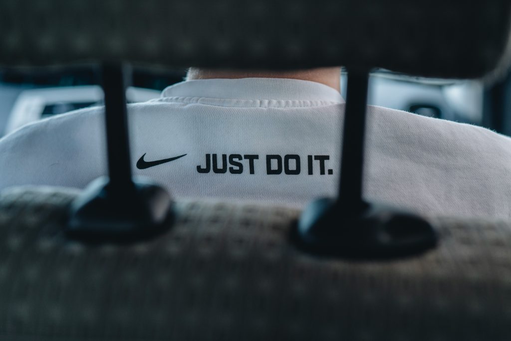
Any word or phrase already exists in general use, so it only becomes yours through years of consistent, repeated pairing with your brand specifically. “Just Do It” is the standard example, three perfectly ordinary English words that took Nike sustained years of use to make theirs alone. A tagline is not a one-off creative decision, it is a long-term investment that only pays off if you keep using the same one.
Fonts: the quiet asset working in the background
On its own, a typeface rarely carries much recognition. We rarely register fonts in isolation, we experience them as part of a bigger picture, paired with colours, logos and layouts. But repetition changes that.
Netflix’s custom typeface has become so recognisable that even a single letter, the “N”, is now enough to signal the brand on its own.
That is the pattern worth copying: pick one typeface, use it everywhere, on invoices and social captions as much as on the website, and let the repetition do the work a font alone cannot.

Why colour is the most underrated opportunity in the room
A 2026 benchmarking study from the Ehrenberg-Bass Institute analysed 1,162 distinctive assets across 21 categories, four countries and nine years, comparing how different asset types perform. Shape-based assets, logos and packaging shapes, came out strongest, averaging 40% fame and 71% uniqueness. Colour assets came out weakest on average, at 12% fame and 39% uniqueness.
Read that the right way round, though, and it is an opportunity rather than a warning. Colour scores low on average precisely because most brands use it inconsistently, a slightly different shade on the website, the van, the social posts and the shopfront, so it never gets the chance to build a strong link in anyone’s mind.
A business that picks one colour and uses it with total discipline, everywhere, every time, is doing something most of its competitors are not bothering to do properly. That consistency is the whole game, and it costs nothing beyond the will to stick to it.
The asset most small businesses forget entirely: sound
Visual assets get most of the attention, but sound is arguably the most underused distinctive asset of all, and one of the fastest to register. A joint study by Veritonic and Audacy found that radio ads carrying a consistent sonic brand cue saw a 17% lift in ad recall and a 6% lift in purchase intent, while podcast ads with the same sonic branding saw a 14% lift in recall and a 2% lift in purchase intent.
If your business has a jingle, a distinctive voice, or even just a consistent audio sting at the start or end of every ad, and you are not using it every single time, you are leaving a genuinely cheap and fast-acting asset on the table.
Packaging shape and pattern: the asset working at the point of sale
For any business that sells a physical product, the shape of the packaging itself, or a pattern on it, can become one of the strongest distinctive assets you own.
Toblerone’s triangular bar, Burberry’s check and Tiffany’s blue box are all textbook examples, each recognisable by shape or pattern alone, no logo required. That strength cuts both ways, though.
When Tropicana redesigned its packaging in 2009 and dropped the familiar orange-with-a-straw image for a cleaner, more generic look, sales fell sharply within weeks, and the company reverted to something close to the original design shortly afterwards. The lesson holds well beyond packaging: an asset that already carries fame and uniqueness is not something to redesign lightly, however dated it might feel to the people who work with it every day.
The cheapest version of all: reviving what you already own
The single cheapest way to build a distinctive asset is not inventing one. It is noticing you already have one, possibly one you stopped using years ago, and bringing it back.
Weetabix is the textbook example. “Have you had your Weetabix?” first appeared as a strapline in the 1990s. The brand moved away from it over the following decade, running other campaign ideas instead. But by 2017, Weetabix brought the line back deliberately, backing it with a £10 million campaign, because the line itself had never actually left people’s memories. It had simply gone quiet. That decision recognised something a lot of businesses miss: an asset does not have to be currently in use to still be famous.
Sometimes the cheapest campaign you will ever run is reviving the thing people already half-remember, rather than paying to build a new one from nothing.
What this looks like in practice: three real examples
Distinctive assets are easiest to spot once you know what you are looking for, so here is what it looks like across three campaigns we have worked on directly.

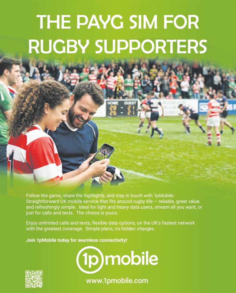
1P Mobile: colour, used without exception. In a category where every major network already owns a colour (EE’s orange, Vodafone’s red, O2’s blue, etc), 1P Mobile’s bright lime green runs through every single execution, the SIM packaging, the press ads, the offer graphics, all the same shade, all the time. There is no ambiguity about whose ad you are looking at before you have read a word of it.
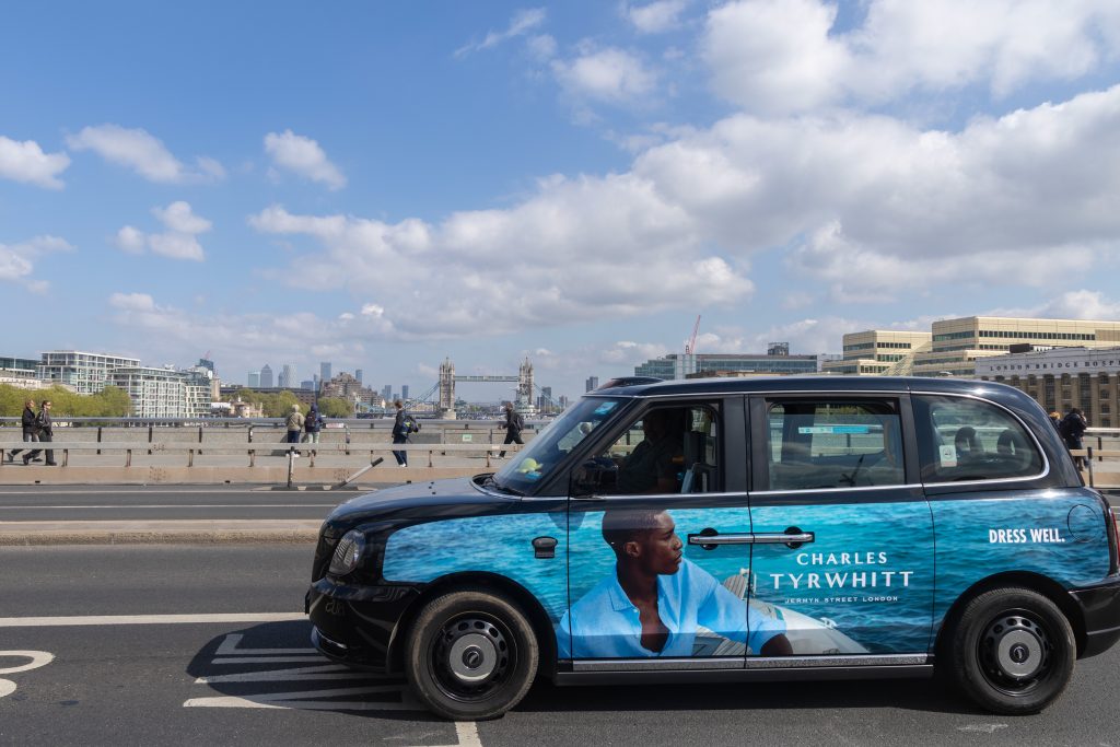
Charles Tyrwhitt: a logo and an imagery style that never varies. Across every campaign we have run for Charles Tyrwhitt, from the Lions Tour collection to the England Rugby partnership to the linen range, two things never change. The wordmark, set in the same wide-letter-spaced serif with “Jermyn Street London” beneath it, appears identically everywhere, out-of-home, press, digital and native. And the photographic style repeats too, a model shot square-on against a bold, solid colour backdrop, whatever the actual product or season. Different campaigns, same visual grammar, so the brand stays recognisable even as the creative changes.
Steppes Travel: logo, imagery and a tone of voice that is unmistakably theirs.
Steppes Travel’s serif wordmark and underline rule appear on every execution, alongside a distinctive teal-toned, art-directed photography style that makes their travel imagery look like nobody else’s.
Just as consistent is the tone of voice, short, confident, almost literary headlines such as “Where Culture Meets Clutch Control” or “China: Future Frontiers”, always closing with the same line, “See the World Better.” Three separate assets, logo, imagery and tone, all reinforcing the same brand, in the same place, every time.
Why this matters for how your media gets bought, not just how it looks
A distinctive asset only builds fame if it turns up identically everywhere it is booked.
A colour that is precise on your website and slightly off on a printed poster is not doing its job.
A sonic logo used in your TV ad but dropped from your radio spots is a missed repetition, and repetition is exactly what builds the fame side of the equation. Part of what a media agency should actually be doing, alongside negotiating rates and picking channels, is protecting that consistency across every single placement, so the same colour, the same logo treatment, the same sound, shows up whether you are on a bus shelter, a paid social feed or a radio break.
Get the media plan right and get the assets wrong, and you have paid full price for recognition you never actually earned.
Your distinctive asset self-audit checklist
Run through this honestly. Most businesses find at least one asset they already own and have simply stopped using properly.
- Could someone recognise your ad with the logo covered up? If not, what is actually doing the recognition work?
- Do you use exactly the same colour, the same shade, everywhere your brand appears, or does it drift by channel?
- Do you have a sound, jingle or audio signature, and does it appear in every audio and video ad, not just some of them?
- Do you use one consistent typeface everywhere, invoices and social captions included, or does it change by platform?
- Do you have a mascot or character, and if not, could one carry more weight than another small logo tweak?
- If you use a celebrity or well-known face, do people remember them afterwards, or your brand?
- Do you have a tagline that is genuinely yours, or one any competitor could use just as easily?
- If you sell a physical product, is the packaging itself recognisable with the label or logo removed?
- Does your photography or imagery style repeat from campaign to campaign, or does it reset with every new brief?
- Is your tone of voice distinctive enough that a line could not be mistaken for a competitor’s, or swapped into their ad?
- Is there an asset you used to use, a strapline, a jingle, a character, that you dropped but people might still remember?
- Does your media agency apply your assets consistently across every channel it books for you, or only on the hero creative?
Not sure which of your assets are actually working?
We can help you find out, and build a media plan that puts real weight behind the ones worth keeping, our LaBs team is ready to transform, integrate and elevate your brand. Drop us an email at sales@hurstmediaagency.co.uk and we will talk you through it.